Creative Brief
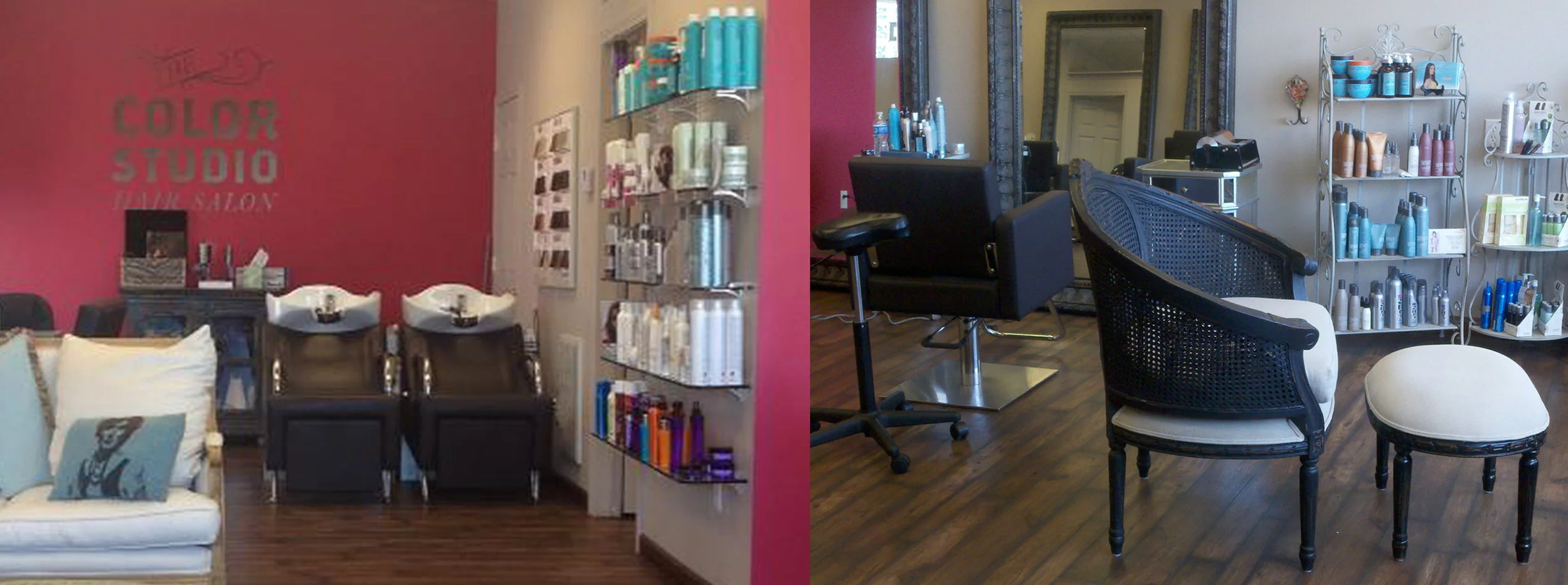
The owner of this salon needed new branding for her shop in Buffalo, N.Y. From the second I met her, I knew working on this project would be pleasant and lively.
Result
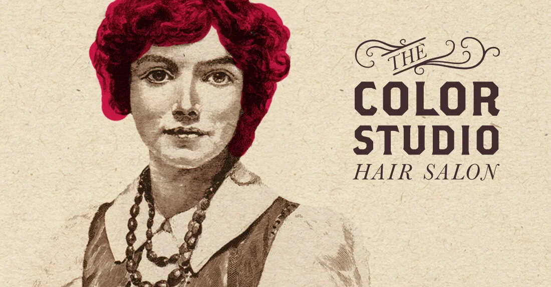
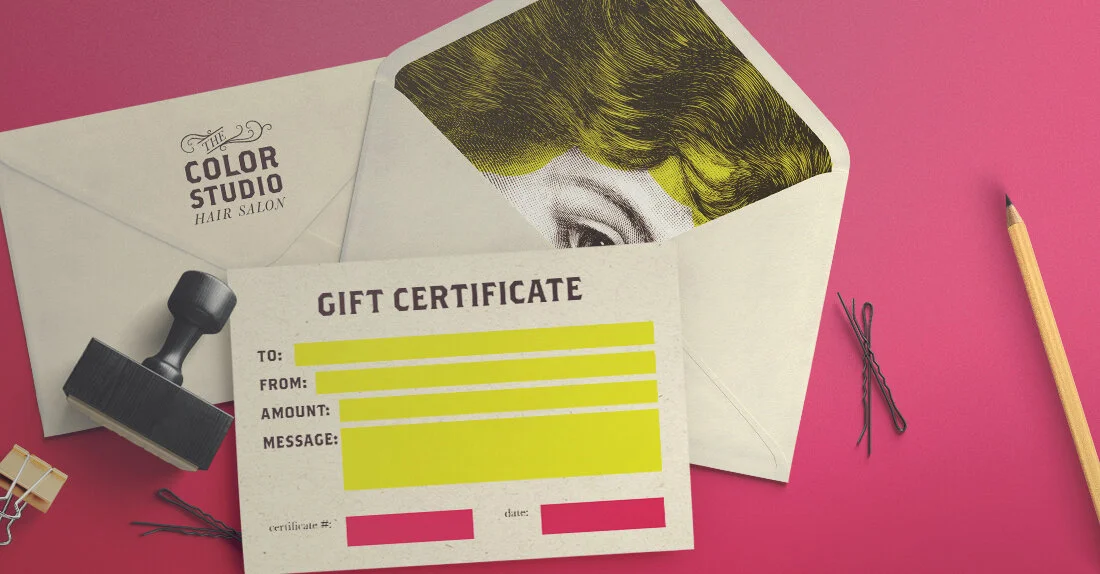
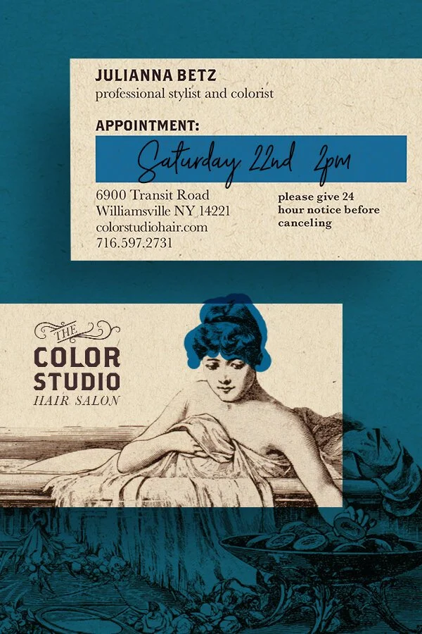
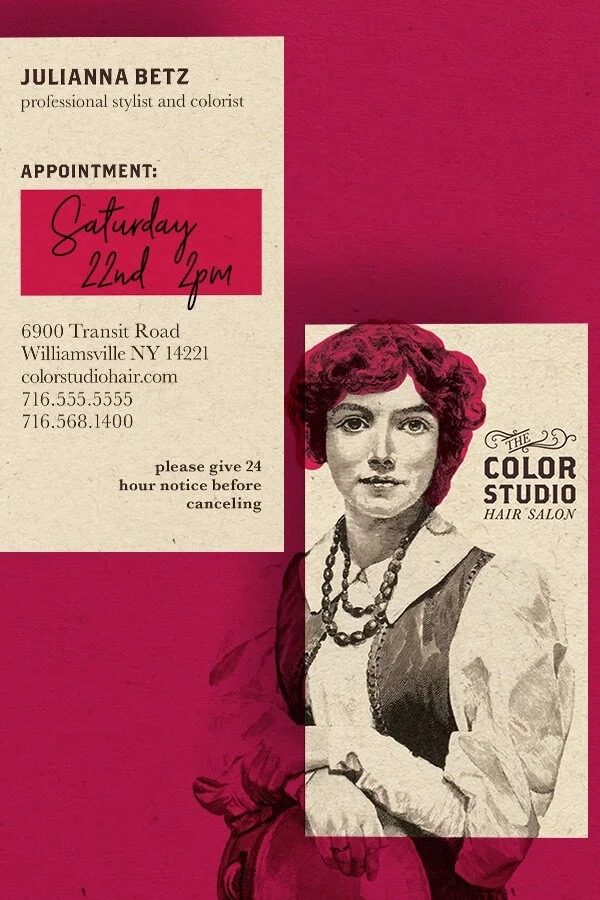
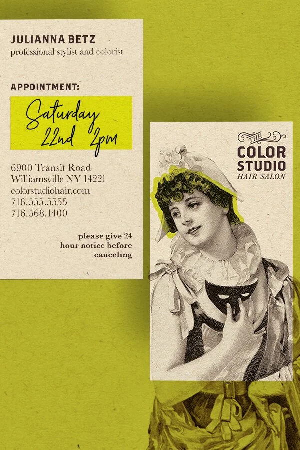
The idea for this branding is to mix something as old as hairdressing with something vibrant and fun like the owner for the salon.
Logo Story
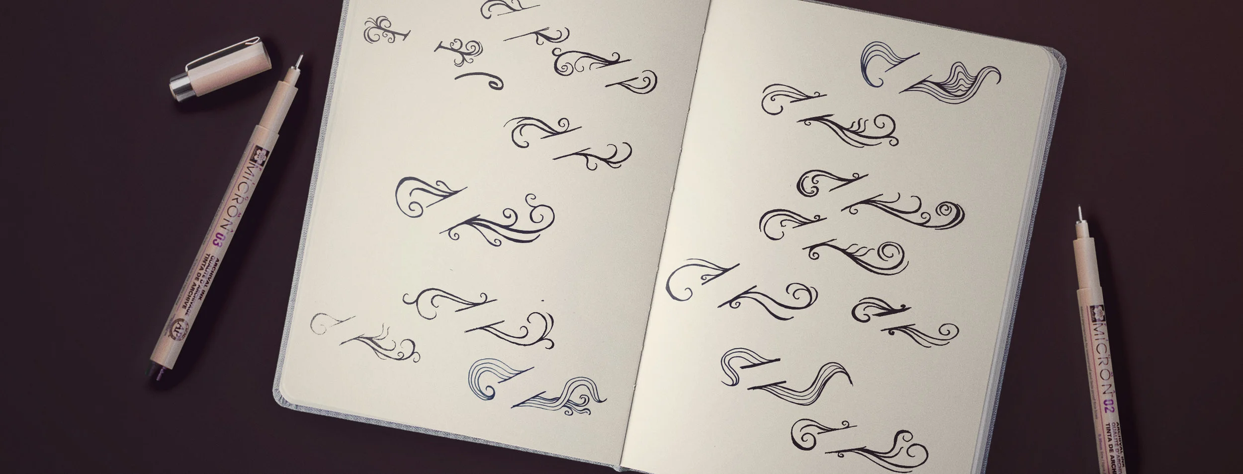
The logotype for the Color Studio also needed to have the mix of old and something new. After researching many typefaces from the 1800's, we landed on using Brothers which has an old-style letterpress look, with a new and modern vibe to it.
Adding Color
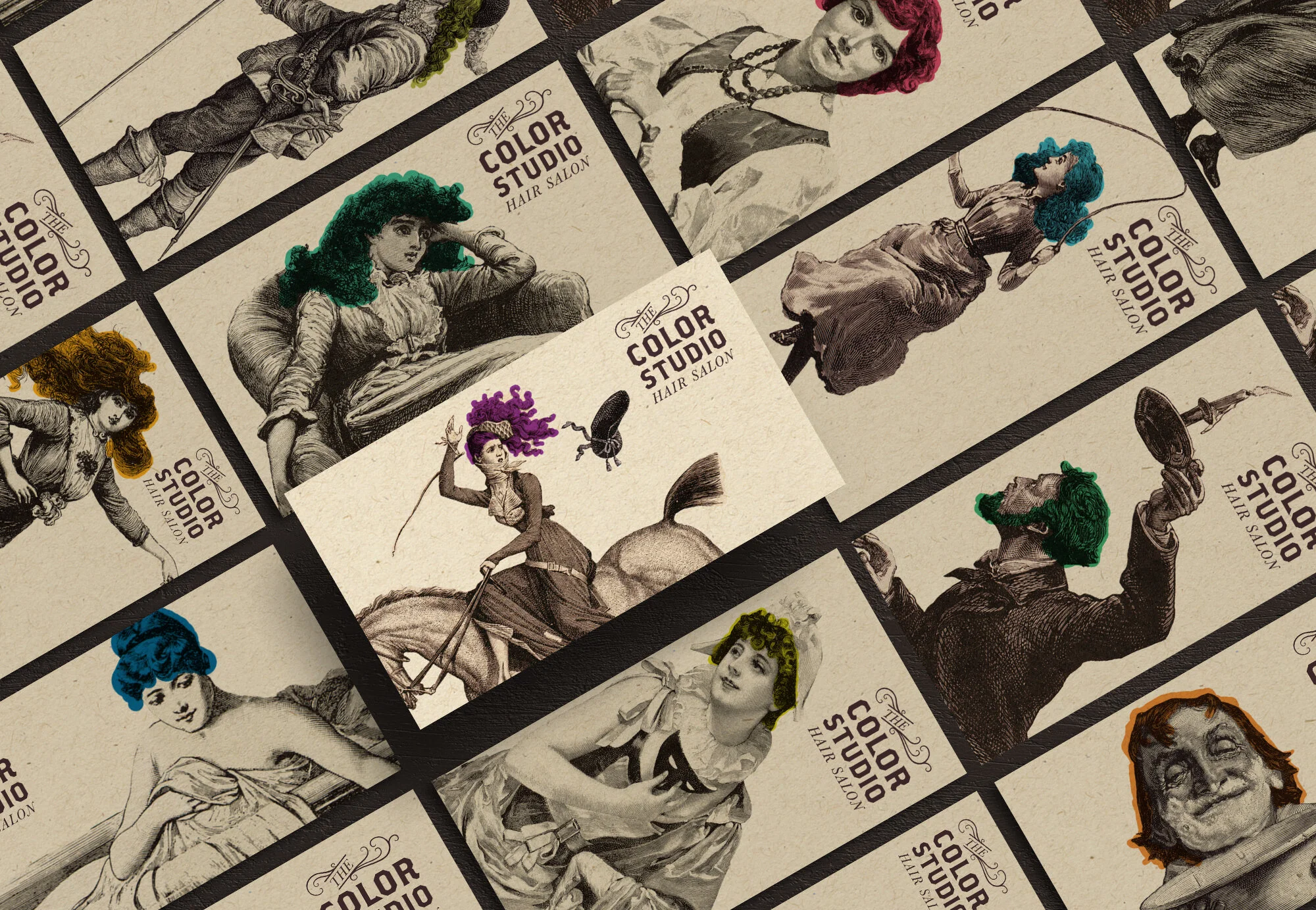
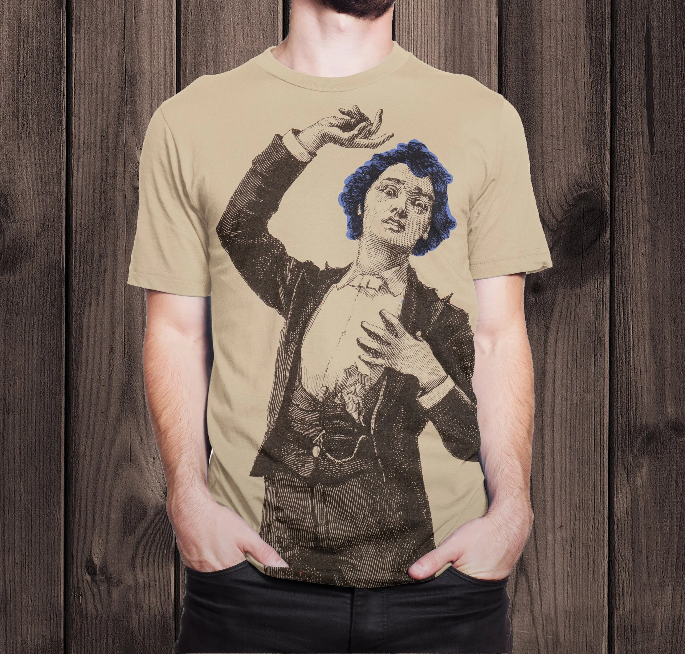
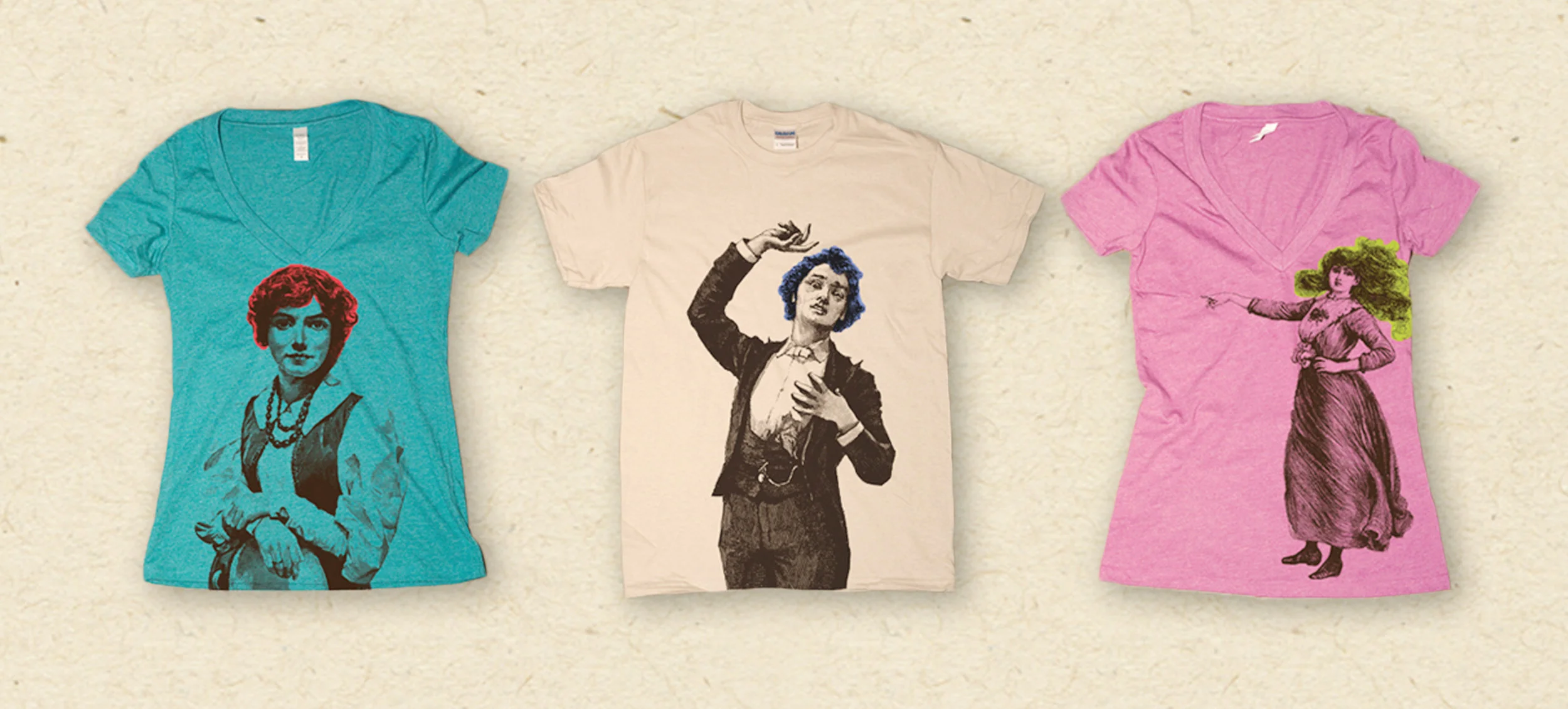
Color was the fun part! Taking old etching advertisements of an array of different and funky individuals, we colored their hair with bright and vibrant colors.
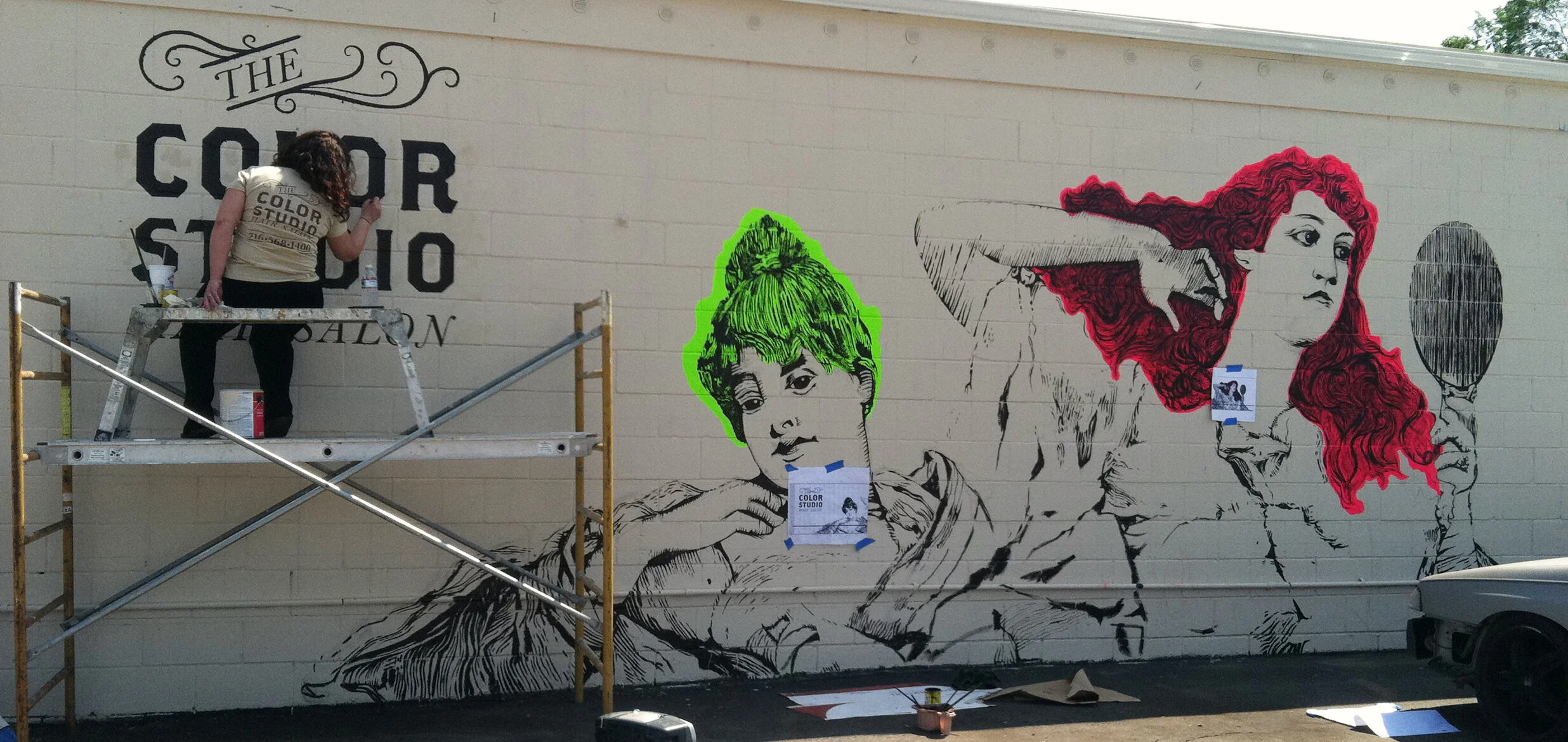
The Mural
The mural is an eye-catcher whenever someone drives by The Color Studio's establishment. This addition to the branding brought more attention to the salon and gave people and idea of how fun the salon is.

