
BTS: How I Designed A Full Brand In 1 Day
Okay… I designed an entire brand in seven hours.
When I say that out loud, it still sounds kind of insane. 😅 Like… what do you mean you built a full mini brand system in one day? But I did it — and the wildest part is that it wasn’t rushed in a chaotic way. It actually flowed so smoothly because I was super locked in, super focused, and (this is the key) I followed the creative direction like my life depended on it.
So in today’s post, I’m taking you behind the scenes of my one-week brand intensive design day, what I worked on hour-by-hour, what I experimented with, what almost didn’t work, and how I made decisions quickly without spiraling into perfectionism.
If you’ve ever wondered what it really looks like to design under pressure — or you’re curious how my process works as a brand designer — you’re going to love this.
And yes… we’re also going to talk about bubble letters. 🫢
The Creative Direction Is What Makes Design Day Possible
Before I even touch Illustrator, I always start with creative direction. Always.
Because if you don’t have a clear creative direction, a 7-hour design day turns into:
scrolling Pinterest for 2 hours
questioning everything
changing your mind 14 times
and then suddenly it’s 4pm and you’ve accomplished… basically nothing 😭
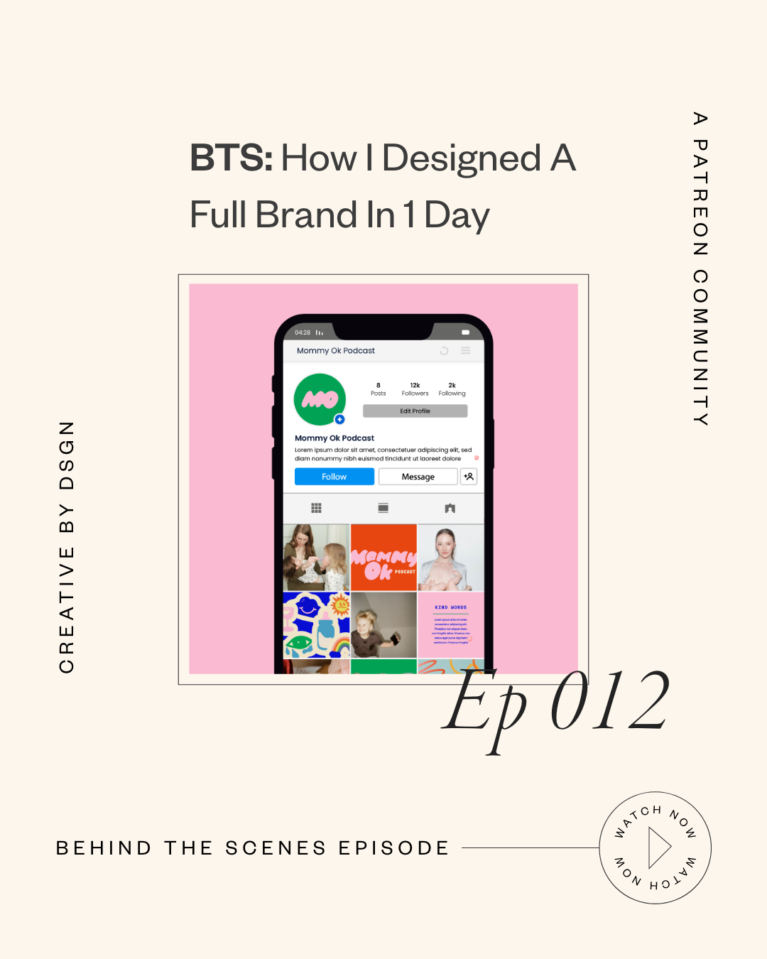
So for this brand, the client wanted something fun, chaotic, bubbly, and very “real mom energy.” This is a podcast called Mommy Ok, and the whole vibe is: the good, the bad, the messy, the hilarious, the ugly-cry moments… all of it.
They specifically wanted:
bubble letters
a childlike rainbow palette
and something that felt almost like a crayon box vibe
And I’ll be honest — bubble letters were not my comfort zone at first. I usually lean more elevated, sleek, minimal, timeless… you know the vibe. But my client wasn’t asking for that. They wanted FUN.
So I had to shift gears and go all in.
(And if you want to see other types of projects I normally do, you can always view my portfolio to get a feel for my typical brand design style.)
Step 1: Bubble Letter Research (Without Buying Every Font)
Because I don’t normally design with bubble fonts, I went to Creative Market and started browsing bubble typography options. I saved like 10 of them.
And here’s a little tip that saved me from spending money before I even knew the direction was approved:
✅ I saved preview images of the fonts (just the image previews)
✅ dropped the PNG into Illustrator
✅ image traced it
✅ expanded + cleaned it up
✅ and used it as a starting point for mockups
That way, I could experiment with different looks and send options to the client without purchasing every single font upfront.
Once they decide what they love, then we go back and purchase the actual font properly for licensing.
Step 2: Messaging the Client… Without Waiting Around
I sent them the font options early in the morning and asked which one they liked.
But here’s the thing… they didn’t respond for three hours.
And I’m not about to sit around staring at Slack like 👁👄👁 waiting for feedback while my design time disappears.
So I picked the one I felt was best, started building the logo direction, and kept moving.
This is SUCH an important mindset shift when you’re working under pressure:
Don’t pause your creative momentum waiting for answers.
Keep designing. Keep progressing. You can always adjust later.
Step 3: The Podcast Cover Experiment That Almost Failed
At first, I thought it would be super cute to include illustrated faces for the podcast cover, since it’s two women hosting the show.
So I drew the faces directly in Illustrator using:
pen tool
thick strokes
hand-drawn shapes
playful hair + cheeks
and bright colors from the palette
But once I combined the illustration + bubble letters… I realized quickly:
🚫 Too chaotic.
🚫 Too much happening.
🚫 Too busy for a podcast cover.
So I messaged them like:
“Hey, I know you want bubble letters AND faces, but I honestly think we may need to choose one direction or the other because together it’s a lot.”
And again… instead of waiting for them to reply, I kept going.
The Moment It Finally Clicked
This was the turning point.
I started playing with:
making the type more vertical
overlapping the bubble letters
adding outlines
simplifying the layout
giving more negative space
moving the illustration higher
And then suddenly it was like…
OH. WAIT. THIS WORKS. 😳✨
To my surprise, the bubble letters actually looked better than the more “elevated” tall typography direction I originally loved.
And that’s the funny part about design — sometimes your client pushes you into a direction you wouldn’t normally choose, and it ends up being the best possible solution for that brand.
Step 4: Color Palette + Font Pairing (My Favorite Part)
Once the logo direction was landing, I moved into color testing.
I like to lay logos over backgrounds to see what actually works — because colors can feel cute individually, but when you apply them across a system… that’s when you see what’s strong.
So I played with:
off-white + pink balance
bold rainbow accents
primary vs secondary colors
contrast tests
and how everything felt together
This is the part of creative strategy that people don’t talk about enough. It’s not just “choose cute colors.” It’s choosing colors that work across:
covers
social posts
templates
icons
merch
and digital platforms
Step 5: Creating a Monogram (The “Blob” Moment)
One thing they loved in the creative direction was this idea of letters morphing together like a blob shape.
So I created an “MO” monogram by:
placing the M and O close together
merging shapes
rounding corners
and smoothing it so it felt organic and playful
This was super simple but it added sooo much personality.
Also PSA: always save original letters on the side before you start merging and combining things. Your messy artboard is your best friend.
Step 6: The Squiggles + Secondary Brand Assets
Next, I started drawing squiggle lines directly in Illustrator with the pen tool using the brand colors.
And this is where the brand really started to feel alive.
These little “supporting elements” are what take a logo and turn it into a full visual identity.
They feel like the brand has movement, energy, texture — and it becomes more than just type.
Step 7: Showing How the Brand Connects to the Existing Brand
This client also had another brand I previously worked on called “Village Four,” and they wanted both brands to coexist.
So I created a quick mockup that said:
“Brought to you by Village Four”
…to show how both brands can appear together without competing.
This is something I do often in brand design when clients have multiple sub-brands and need cohesion without making everything identical.
(And if you want to work with me on a brand system like this, you can work with me here.)
Step 8: Icon Design in Adobe Fresco (Yes, I Used My iPad)
For the icons, I found inspiration that was whimsical, imperfect-but-clean, playful, and balanced.
And I loved it so much that I decided to draw them on my iPad in Adobe Fresco using my Apple Pencil.
My process was:
import the color palette
draw each icon on separate layers
group layers per icon
hide icons as I finished them
export as a layered PDF
bring into Illustrator
smooth + refine edges
And honestly… they turned out so good.
This is one of those times where the illustration process actually added so much uniqueness and charm to the brand.
Step 9: Social Media Templates (Using My Grid System)
Because I already have templates and systems built, creating a mock Instagram grid was super fast.
I dropped in:
icons
monograms
logo patterns
squiggles
brand fonts
and curated imagery
This is why having reusable design systems matters. When you’re building a brand in a short amount of time, templates help you move fast without sacrificing quality.
The Timeline: What I Got Done in 7 Hours
Here’s the breakdown:
✅ First 3 hours:
logo exploration
podcast cover direction
color palette lock-in
YouTube banner mockup
supporting elements starting to form
✅ Next chunk of time:
icon creation
squiggle assets
social templates
extra brand slides + visual layout
By the end of the day, I presented 8 pages of assets + mockups and they were thrilled.
And no, this doesn’t always happen. Some design days are slower because clients get stuck on the logo and feedback takes longer.
But this time? They trusted me. They let me do my thing. Everything clicked.
Packaging Final Files Took WAY Longer Than Expected
Not gonna lie… the next day was intense.
Because I had:
icons
textures
logo variations
squiggles
abstract blur shapes
multiple assets in multiple formats
And some effects weren’t exporting properly through Logo Package Express, so I had to do certain exports manually.
But the upside is: because I use templates for brand guides, I was still able to deliver everything in one day.
What I Learned (And What I’d Do Differently)
Here’s what stuck with me most:
Working under pressure can actually work really well.
It kept me focused and decisive.
This was the most assets I’ve ever delivered in an intensive.
And now I’m thinking about how that affects the difference between my Essentials package vs One-Week Intensive.
Creative direction is EVERYTHING.
It’s the only reason design day works.
Also… clients are sometimes so happy that they ask for extra things after. And I’m okay making exceptions occasionally, but I always remind them: anything beyond the design day is outside the original scope.
Let’s Chat 💛
If you made it this far, I need to know…
Have you ever designed something under pressure and surprised yourself with how much you got done?
Or do you struggle with staying focused when you’re on a time limit?
Drop a comment below and tell me what part of your process feels the hardest right now — I’d love to chat with you in the comments and hear what you want to learn next.
And if you want to explore more of my work, you can see more projects here or check out what I offer through my studio on my services page.


