

Brand Strategy
Brand Identity Design
Package Design
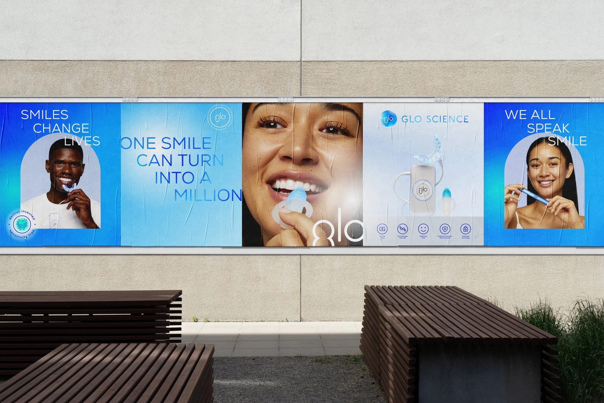
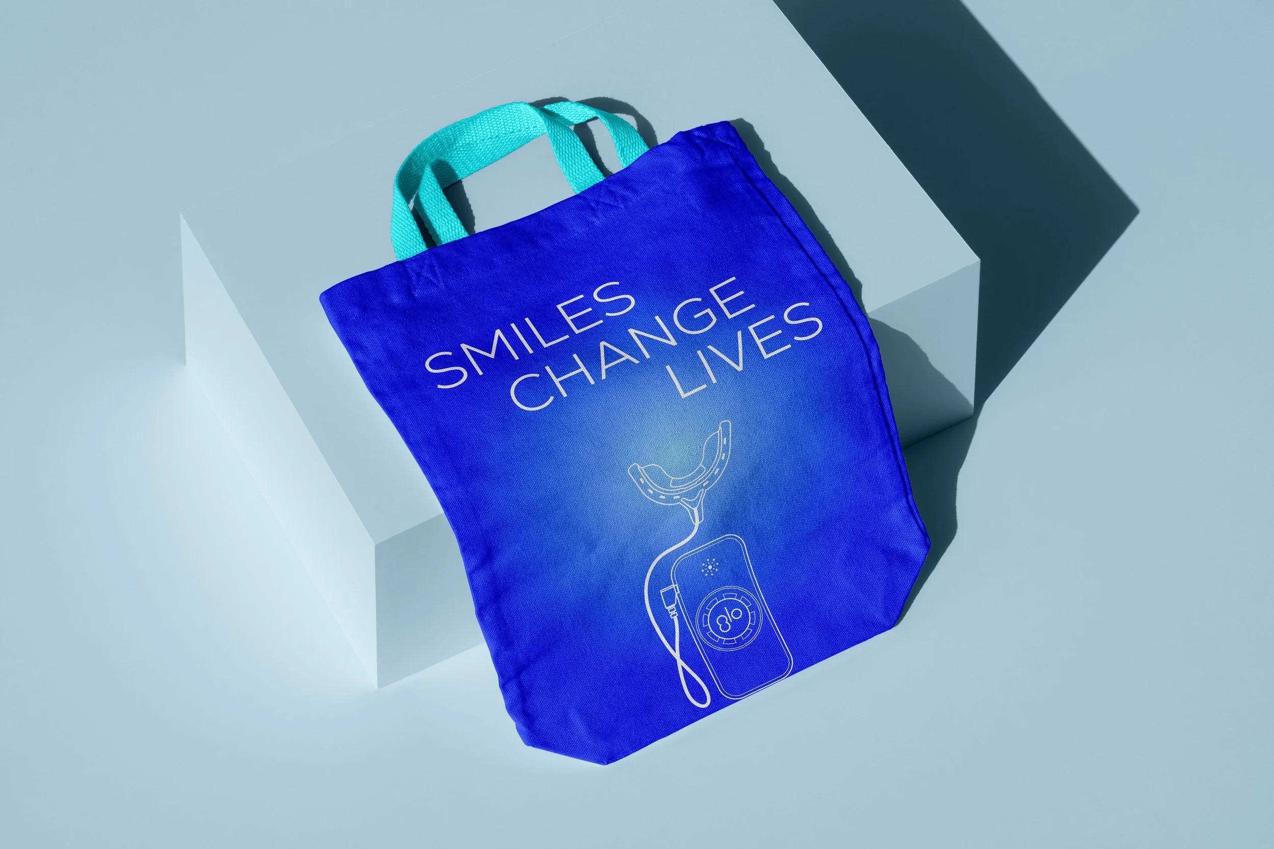
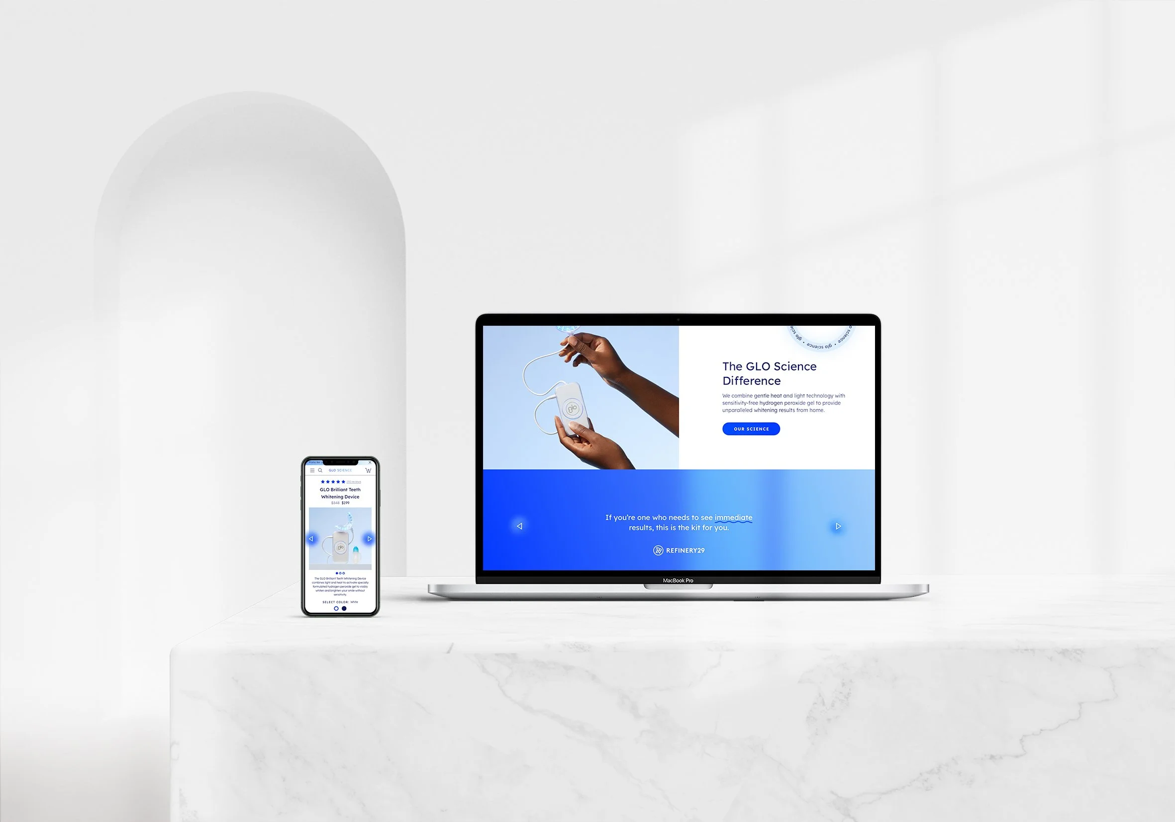
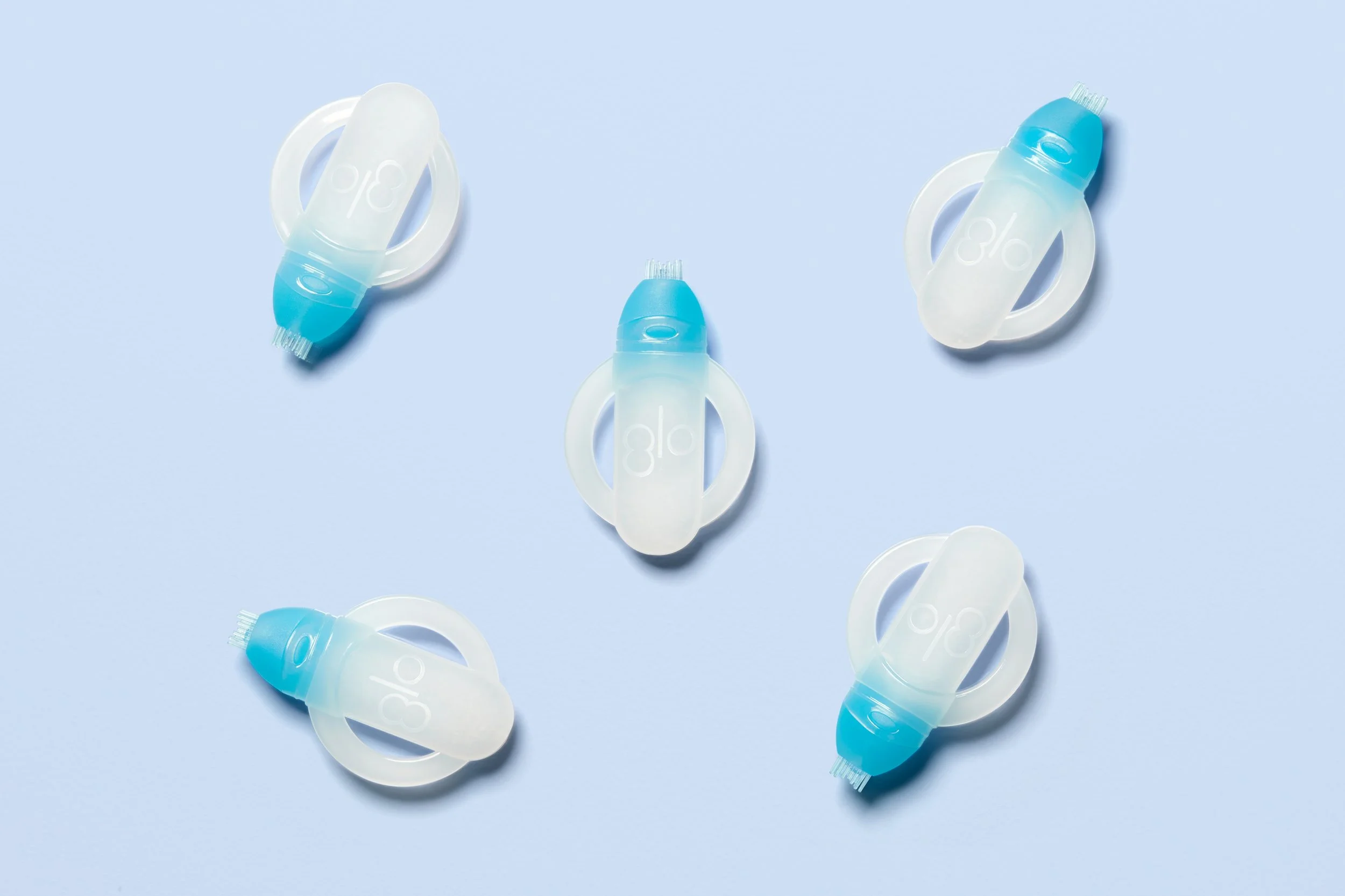
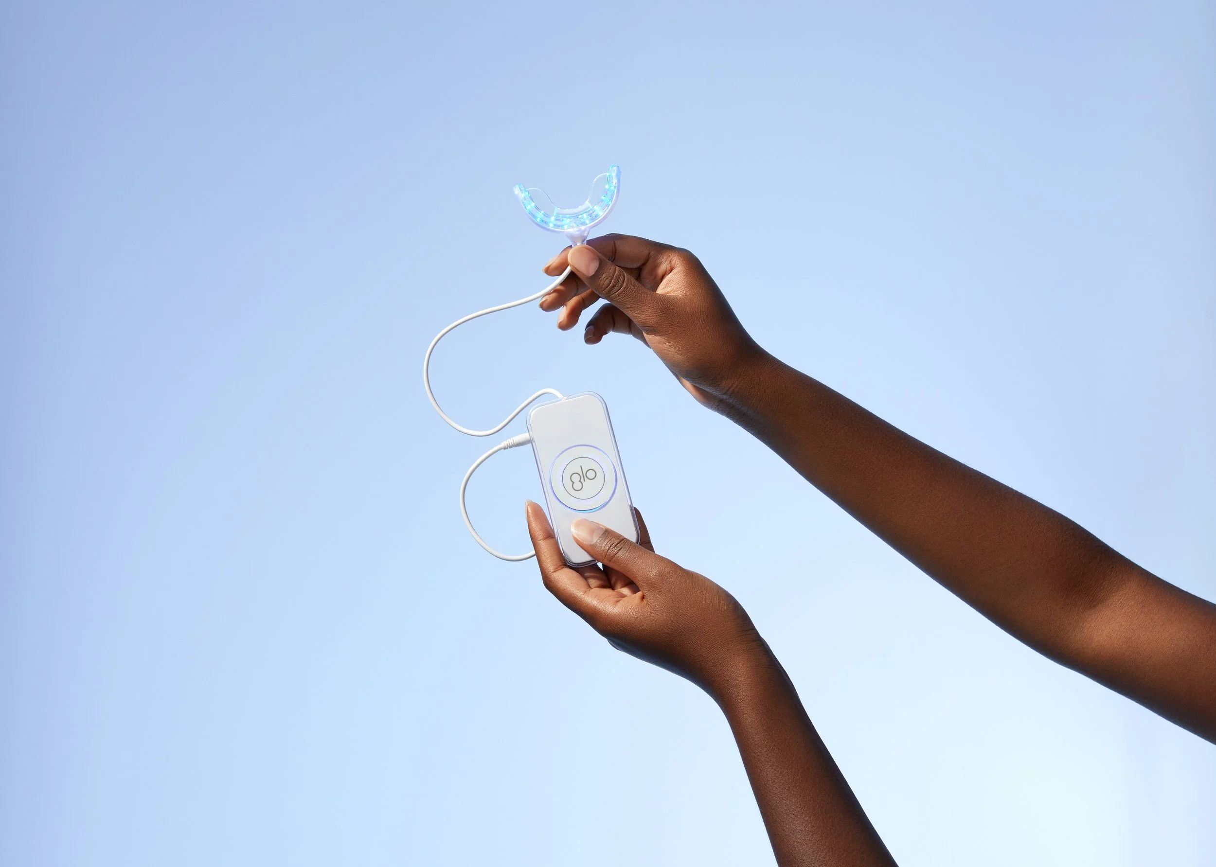
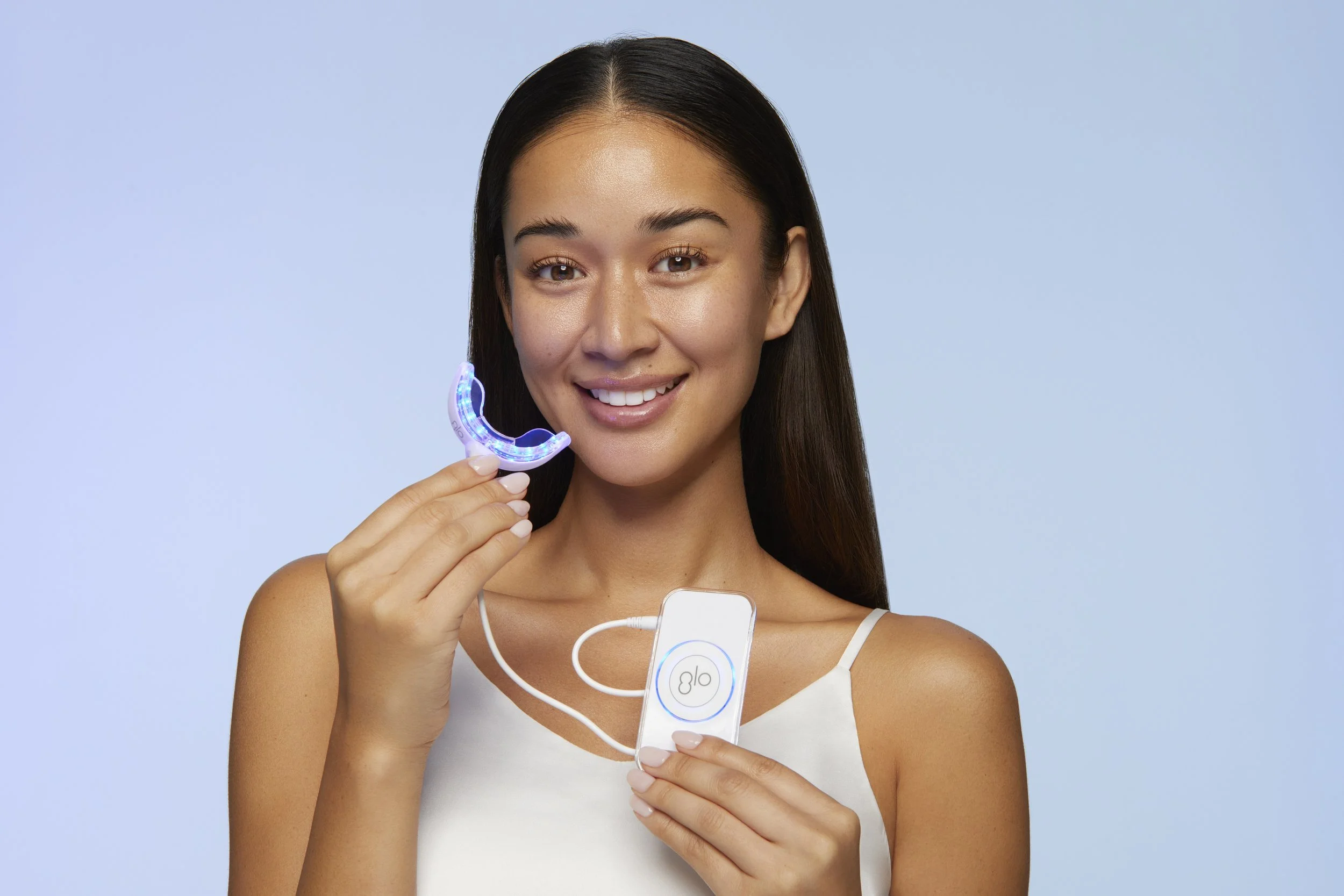
At the intersection of science and soul, GLOScience revolutionizes at-home teeth whitening with its patented Guided Light Optics technology. Their sensitivity-free system empowers you to achieve a glowing smile that exudes confidence.

To preserve brand heritage while injecting a modern edge, we kept the original wordmark—where the “g” echoes an 8 and “lo” follows—yet introduced a dynamic orb gradient treatment. This gradient evokes the vibrant, tech-forward spirit of GLOScience, hinting at the microscopic brilliance of teeth whitening in action. The result is a logo that seamlessly marries familiar branding with a fresh, innovative visual language that reflects both science and movement.
Brand challenges:
Targeting multiple markets
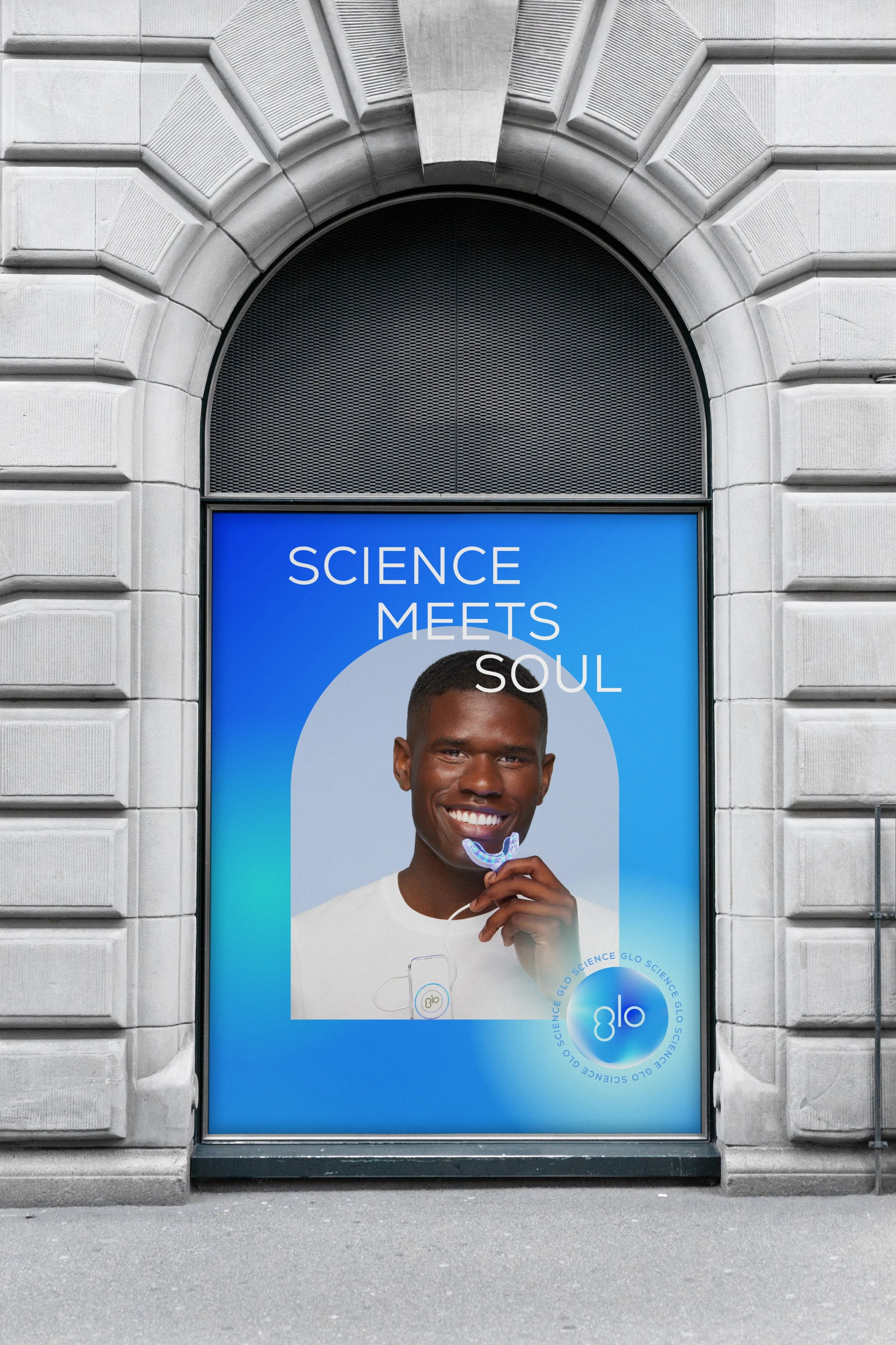
Targeting three diverse audiences—direct consumers, retail partners, and professionals—we unified the visual design to resonate powerfully with every segment.
Warm Glow with a Cool Palette
Merging a cool color palette with a subtle warm glow, we captured the essence of gentle luminosity, evoking both scientific precision and inviting energy.


Differentiating in Blue
Within the trusted blue spectrum, we crafted a distinctive look that set GLOScience apart while reinforcing its identity as a leader in innovation.
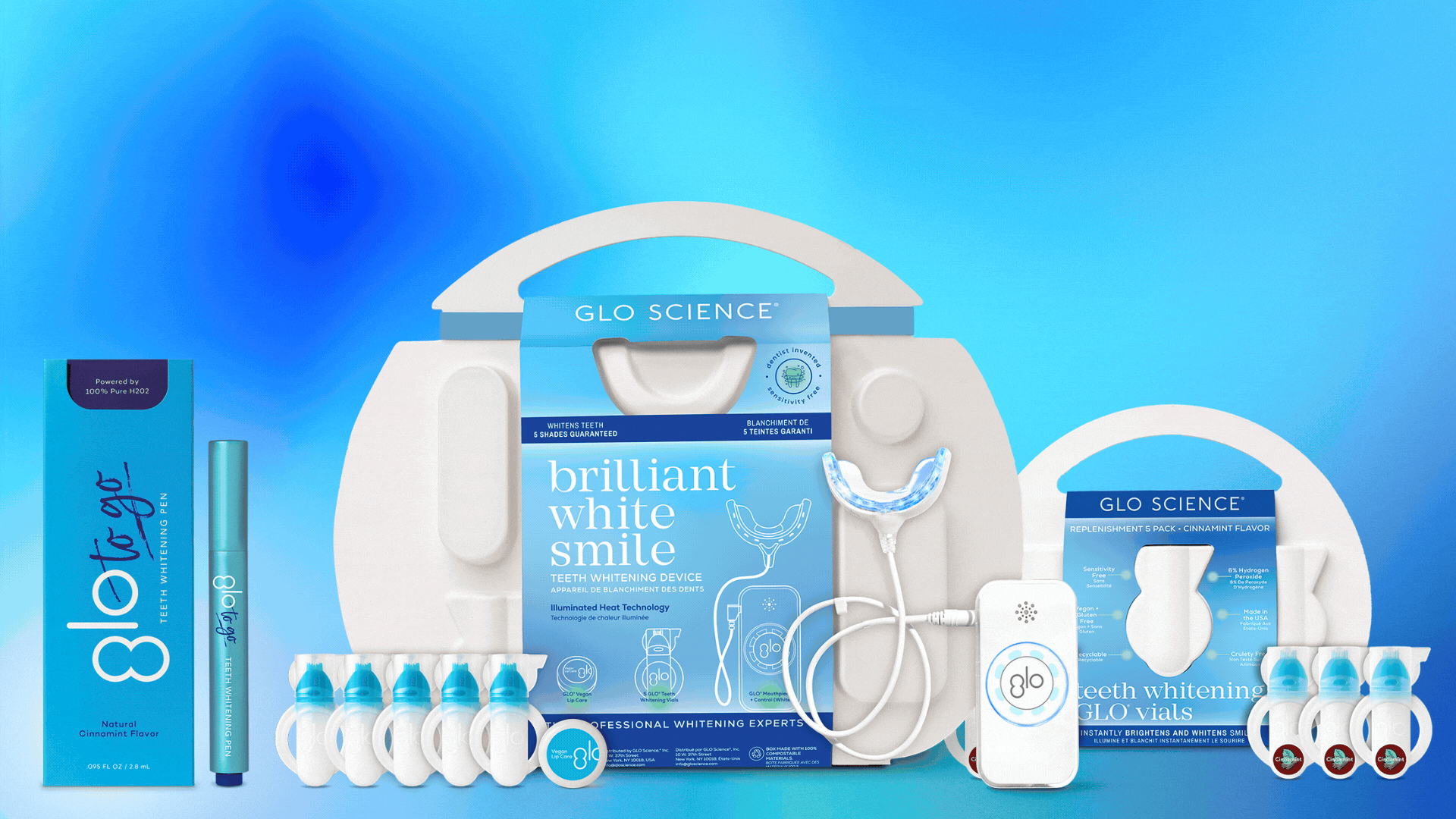
Innovative Packaging
We devised innovative packaging that not only captivates on the shelf but also powerfully communicates GLOScience’s advanced technology and superior quality.


MORE PROJECTS
-
MORE PROJECTS -
-
![]()
Blank Digits
-
![]()
Hella Cocktail
-
![]()
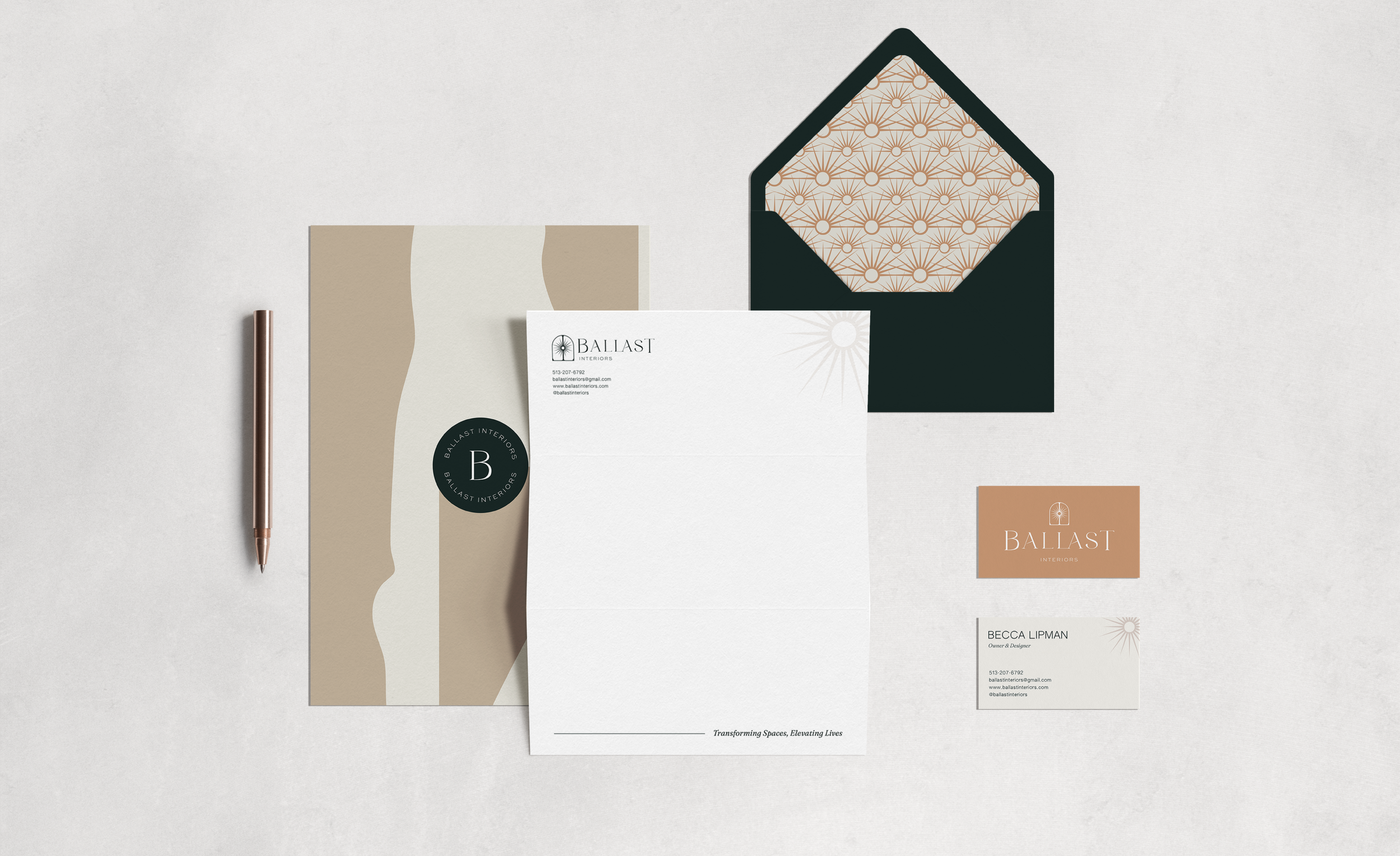
Ballast Interiors
-
![]()
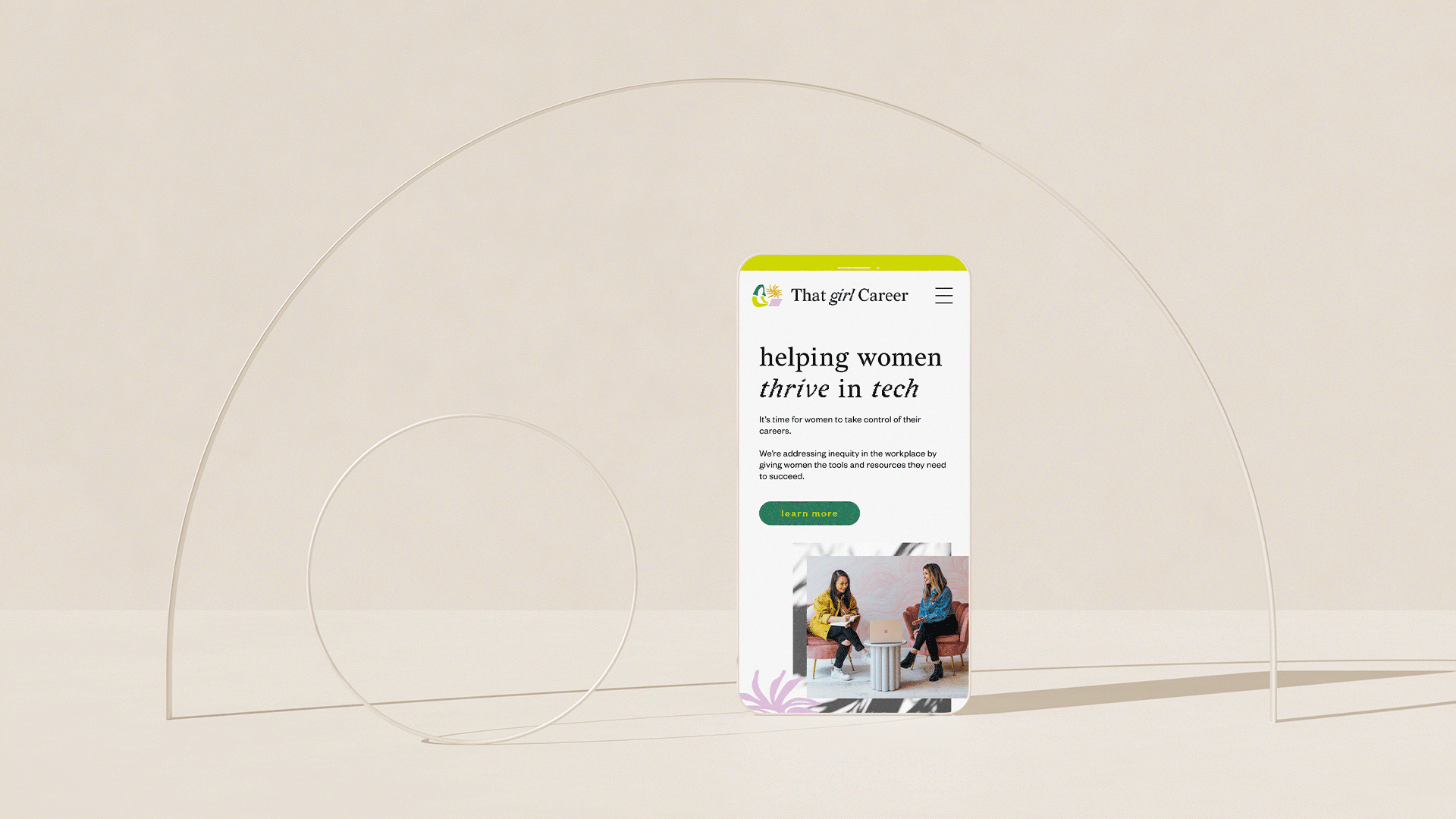
That Girl Career
-
![]()
Sea Breeze Reality
-
![]()
Cotton Love Studios
-
![]()
The Body Process
-
![]()
Fountain Hill Winery
-
![]()
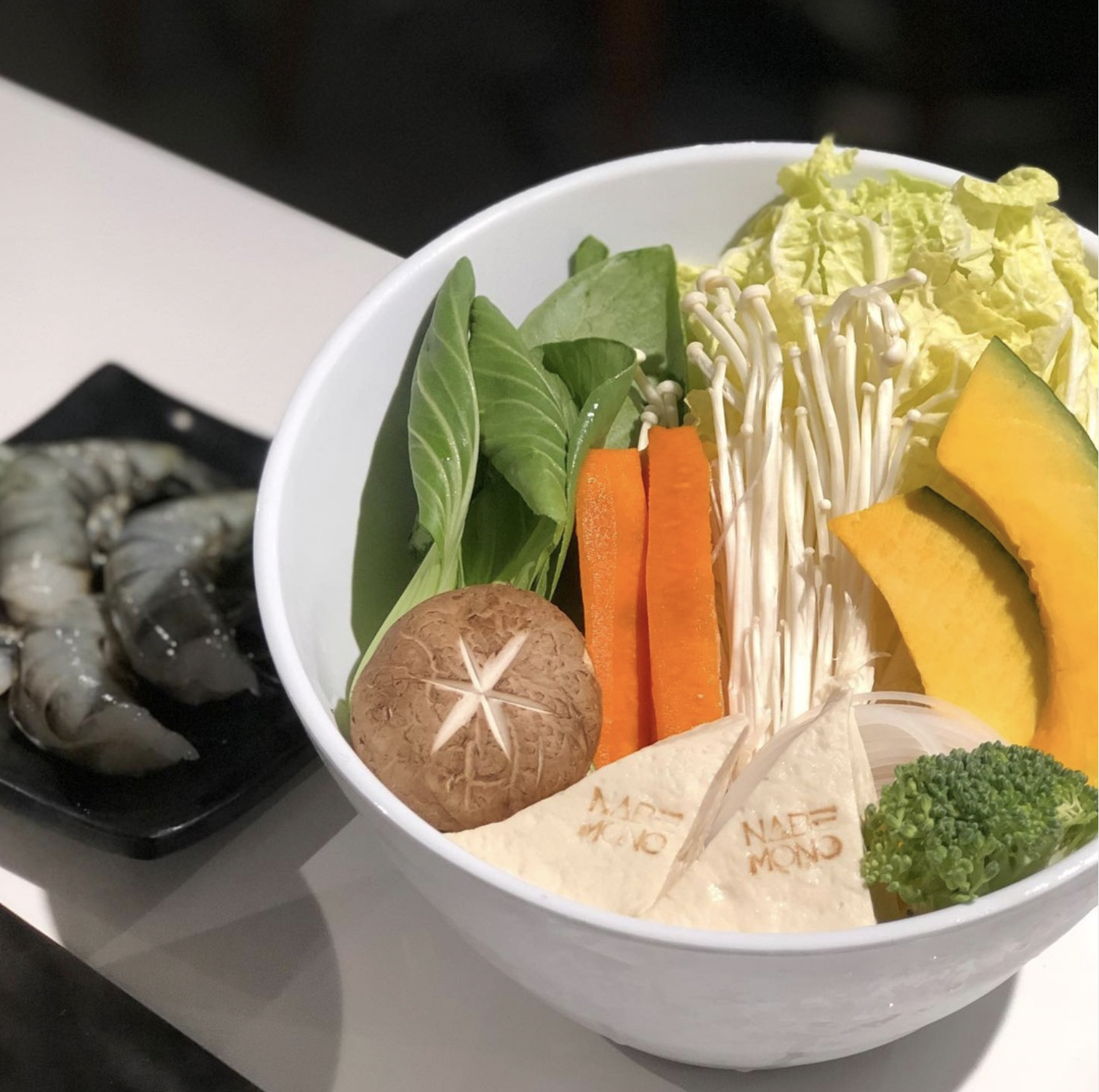
Nabemono
-
![]()
Lil' Vegerie
-
![]()
LUXE RBG
-
![]()
Oralife
-
![]()
Vendi
-
![]()
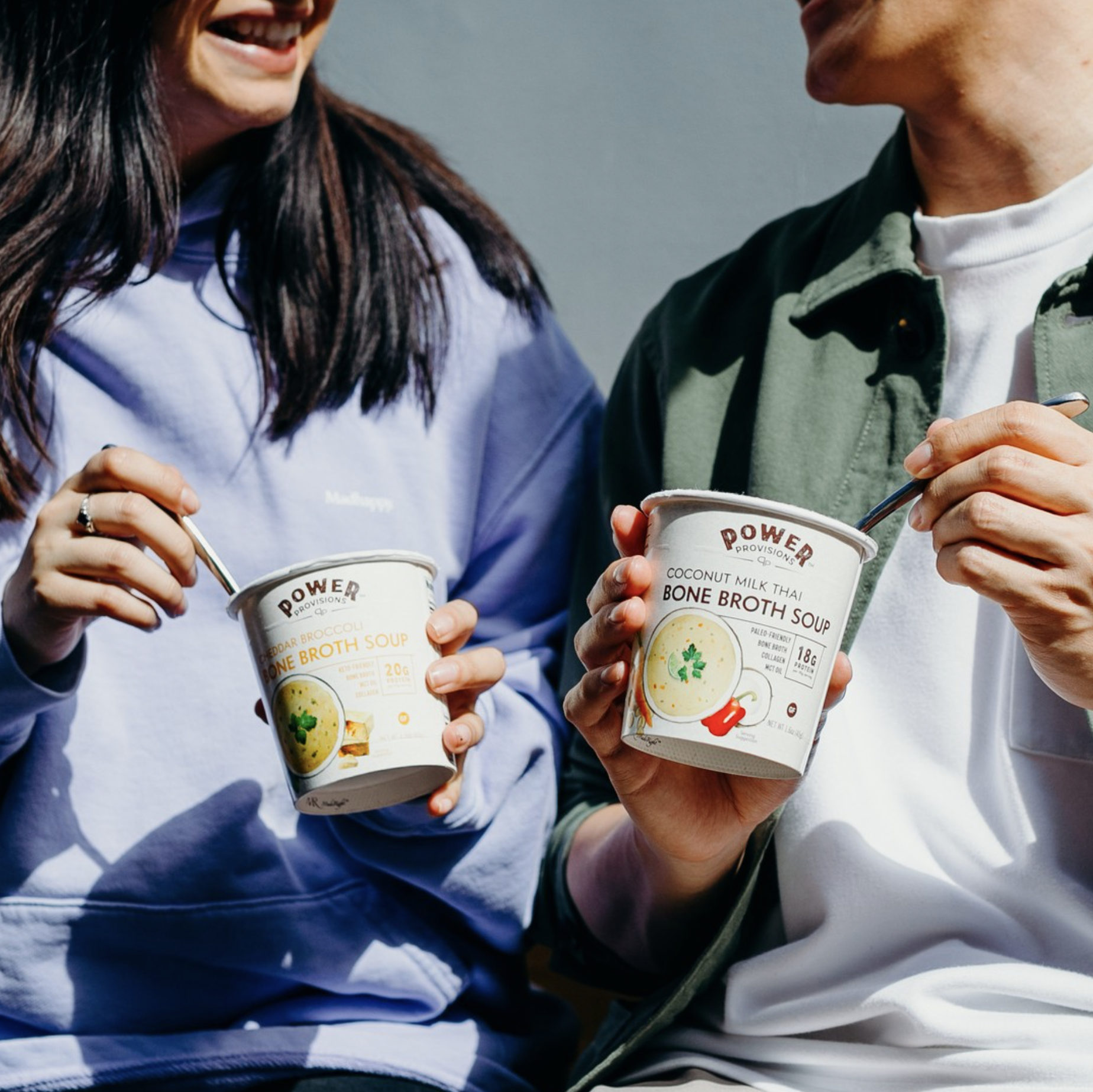
Power Provisions
-
![]()
GLO Science


SERVICES
Brand Identity
Custom Icons
Package Design

Next Project
Sea Breeze Realty