
The Step-by-Step Process Behind My Viral Brushstroke Patterns
Let’s rewind to 2017.
I had just left the corporate world, started my own design studio, and was building my brand design portfolio one scrappy project at a time. One of those projects? A set of brushstroke patterns I painted by hand.
At the time, I didn’t think much of them. I scanned them, cleaned them up, turned them into vector patterns in Illustrator, added them to my website and Pinterest boards… and moved on with my life.
Fast forward to today, and those patterns — the ones I didn’t even love — are still racking up thousands of impressions on Pinterest. I’m talking 2,000 here, 3,600 there. All from a project I honestly forgot about.
So today, I’m breaking it all down. Why those patterns worked, how I made them, and how you can do the same — even if you don’t consider yourself an illustrator.
Let’s get into it.
When the Work You Don’t Love Becomes Your Most Loved
Isn’t it wild how the internet works?
We obsess over a design for weeks, tweaking every little corner and curve, and when we finally post it… crickets. Then there’s that one thing you made in a creative sprint with no expectations — and that’s the one that takes off.
That was this pattern project.
It’s a reminder that we are not our best judges. What you might consider “meh” could be exactly what someone else has been looking for.
If you needed a little nudge to share your work — even the stuff you’re not 100% in love with — let this be it. You never know what will resonate.
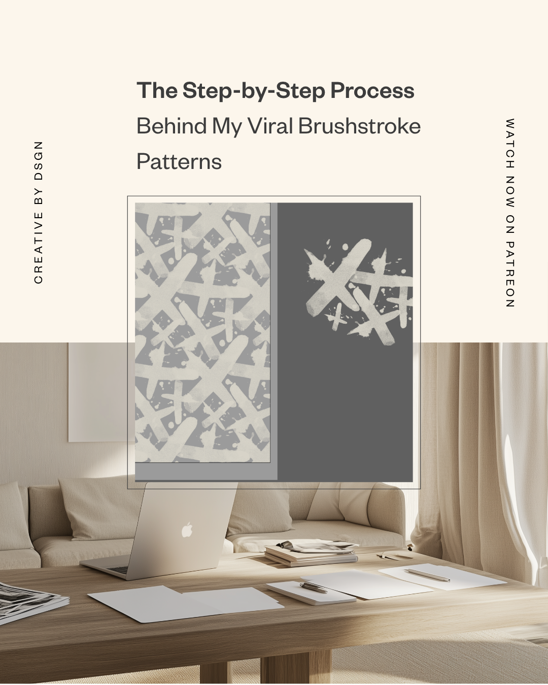
The Illustration Process: From Paint to Pattern
This was a real, hands-on, messy desk kind of project. Here’s how I created the repeat patterns that went viral (kind of) and still bring traffic to my site years later.
Step 1: Painting by Hand
I started with actual paint and paper. Some strokes were made with ink, some with acrylic, some with makeup (yes, makeup — this was for a beauty brand!). I let them dry fully, then scanned them in at high resolution.
Step 2: Clean-Up in Photoshop
Once scanned, I used Photoshop to remove the watercolor paper texture. Here’s how:
I adjusted the Levels to brighten the background and eliminate paper grain.
Then I converted the file to grayscale, flattened it, and saved it as a bitmap. (This helps preserve the texture but keeps the file light and editable.)
Step 3: Converting to TIFF
I saved the bitmap as a TIFF so Illustrator could easily interpret it. TIFFs work great for keeping detail while allowing color control later.
Step 4: Importing Into Illustrator
Dragging the TIFF into Illustrator gives you a totally editable graphic. And the cool part? You can change the color of the bitmap texture on the fly — no need to rework in Photoshop.
This is where the magic happens: by rotating, scaling, and overlapping your strokes, you can build your own repeat pattern layout.
Step 5: Building the Repeat Pattern
Once I had the brushstrokes arranged how I liked, I selected them all, embedded the images, and went to:
Object > Pattern > Make
From here, I played with the pattern tile settings (Hex by Row is a fave), tweaked the spacing, and adjusted the overlap until it felt balanced.
I clicked Done, and voilà — it saved to my swatches panel as a repeat pattern ready to use on any background.
Why These Patterns Took Off on Pinterest
Let’s talk numbers for a sec.
Because I’ve been looping these patterns on Pinterest using Tailwind, they’ve had years of exposure. I’ve seen patterns from this collection get over 3,600 impressions, and many others have hit over 1,000.
And remember — these are patterns I made in 2017.
So what made them work?
Here’s my theory:
They look handmade, not overly perfect.
The brushstrokes vary in size and taper off naturally, so the final layout feels organic.
They’re flexible — neutral enough for modern branding, bold enough for packaging design.
And I posted them. That’s it. Sometimes, it really is just about hitting publish.
A Few Creative Strategy Lessons
This project taught me a lot — about sharing my work, about pattern design, and about not being so hard on myself as a designer.
Lesson 1: Share Your Work (Even If You Don’t Love It)
You don’t need to wait until something feels “portfolio perfect” to post it. Done is better than perfect. And the longer you wait, the more likely you are to overthink it.
Lesson 2: Work Doesn’t Expire
That thing you made five years ago might not be your favorite, but that doesn’t mean it’s irrelevant. Audiences evolve. Tastes change. Something that’s old to you might be brand new to someone else.
Lesson 3: Tailwind Is a Game-Changer
I’ve been looping my pins using Tailwind, which helps my best-performing posts stay in circulation without me manually reposting them. If you’re a designer with a library of work, this can keep you top of mind with minimal effort.
Want to Try It Yourself?
This process works for any hand-drawn or painted element. If you love drawing, lettering, painting, or making textured marks, you can scan your work and use the exact steps I shared to turn it into patterns for:
Product packaging
Branding systems
Website backgrounds
Social media templates
Digital product assets
Whether you’re working on a new brand design or creating packaging design that feels more organic, this process adds that handmade magic.
Let’s Keep This Creative Conversation Going
If you’ve been sitting on a project you haven’t shared yet, I hope this post encourages you to post it anyway.
And if you end up trying this illustration technique — or have a pattern-making process of your own — I’d love to hear about it. Drop a comment or send me a message. Seriously. I want to cheer you on.
✨ Want to see more behind-the-scenes posts like this? Check out the Creative by Design Patreon for full episodes, templates, and deep dives into my process.
Let’s keep making and sharing the messy, imperfect, magical stuff.


